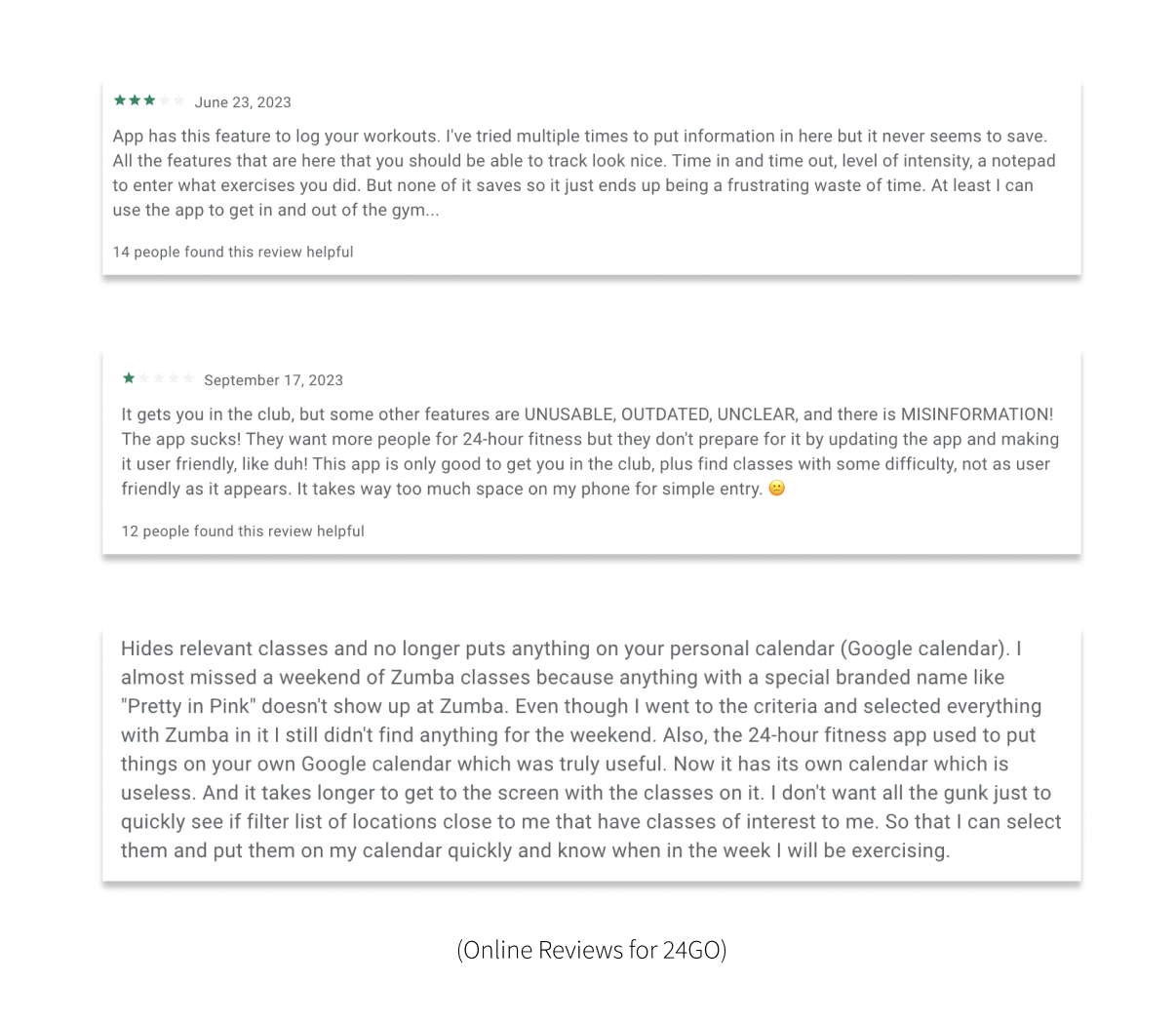
As a UX designer, I redesigned 24GO to address the significant UX/UI issues that created navigation issues for gym-goers, so users can book classes and create their own workout plan to propel fitness purposes.
Painting the Picture
Problem Statement
Identifying and addressing user experience inefficiencies with scheduling classes and creating workout routines within the 24 Go mobile app to enhance functionality, improve user satisfaction, and ensure seamless access to fitness resources and services offered by 24 Hour Fitness.
Objective
The primary objective of 24GO's redesign is to cultivate an enhanced user experience that places users fitness goals first and implementing newfound accessibility that incentivize user engagement without being a buggy burden upon accessing the app. Our redesign initiative centered on streamlining the process of joining classes and designing workouts, prioritizing user-friendly features and a visually appealing interface. By emphasizing ease of navigation and accessibility, the goal was to empower users to open the app with feelings of achievement and enjoyment throughout their ongoing fitness journey.
Research
User Personas
Using two different types of personas help us redesign 24GO knowing what our users expect and need from the app.
While both personas are different in age and responsibilities, they don't have the necessary time allocation to freely purchase food or drinks in person.
Enter, Teiki, to solve their time issues.
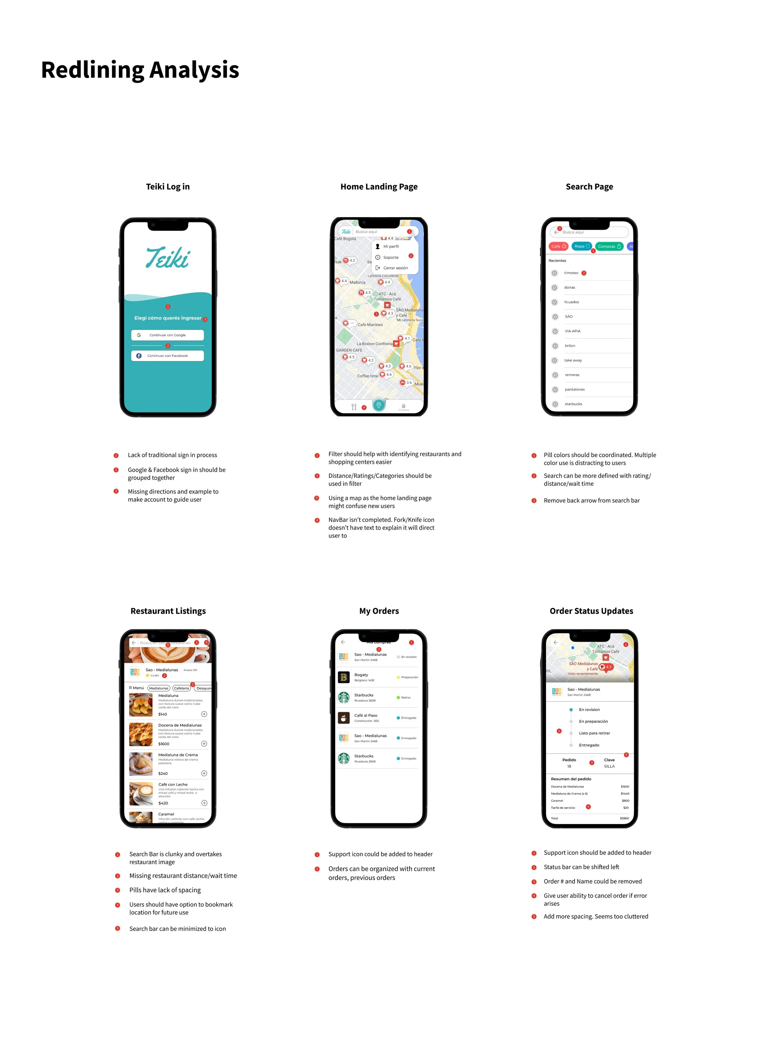
Redlining Analysis
To improve user experience and functionality, we listed out current pitfalls in the current 24GO mobile design.
Ideation
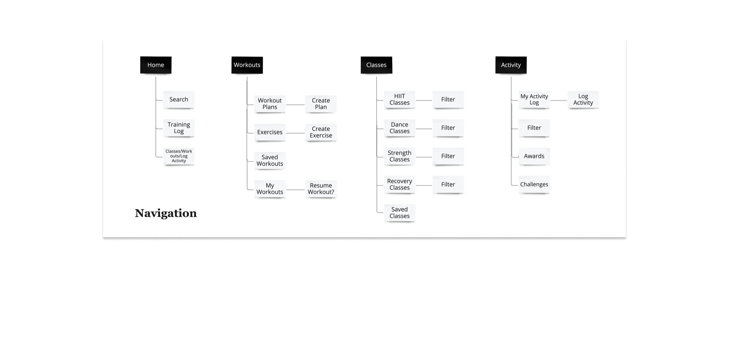
Site map for 24GO redesign
Task Flow
Pathway for completing task within app.
Scenario #1 - A new user named Josh wants to create his personalized workout schedule.
Scenario #2 - A frequent Group X member wants to reserve her spot for HIIT class.
Solutions
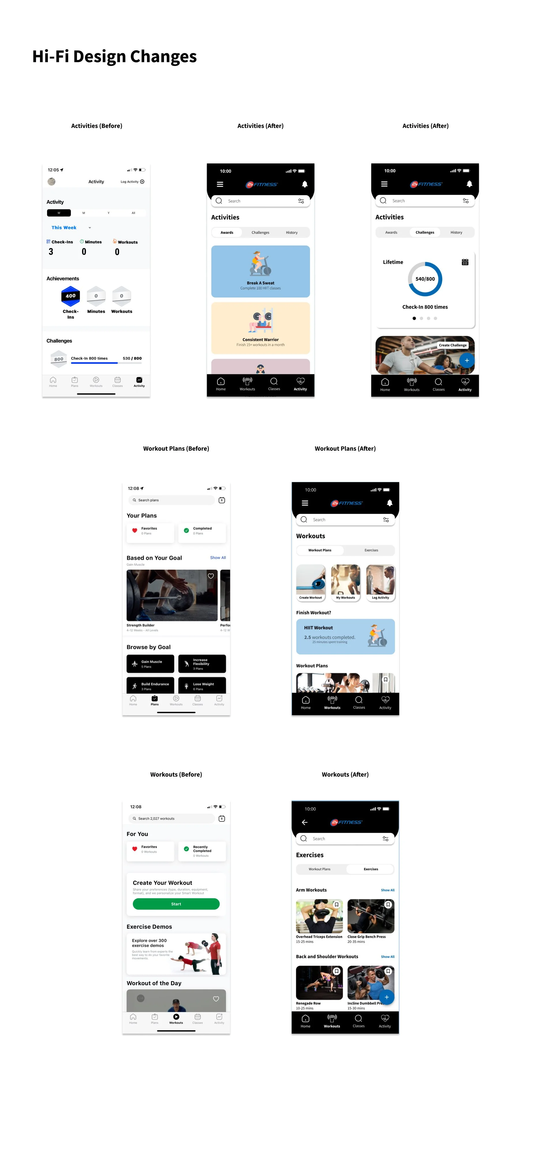
The primary objective driving the redesign of 24Fitness Go was to augment brand recognition, enhance user interface (UI) functionality, and cultivate a more engaging user experience upon login. The integration of our brand identity within the app's header was deemed essential to fortify our app's distinctiveness vis-à-vis competitors. The revamped UI facilitates members' navigation to classes, workouts, and activity logs through clearly delineated visual representations.
Onboarding
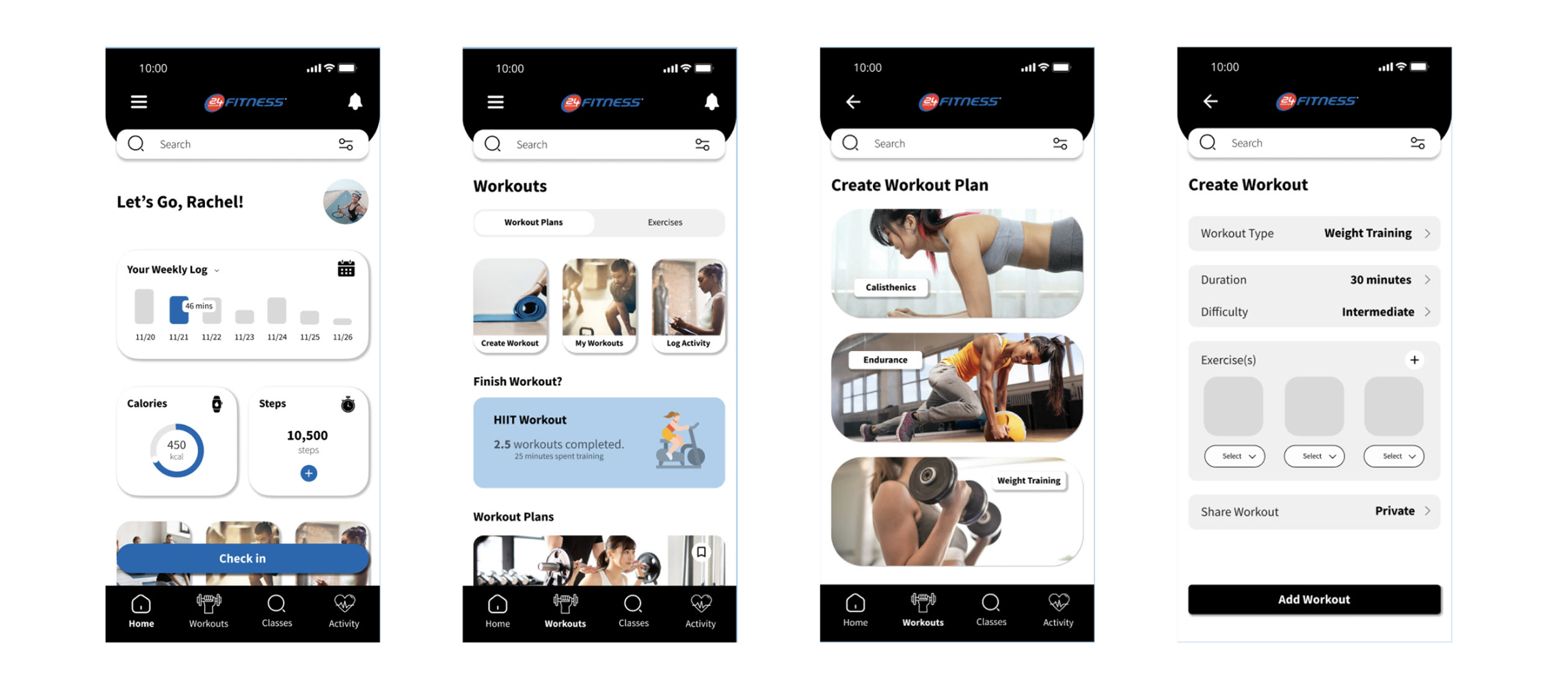
To improve user experience, I added the following to the home screen:
Statistics include your weekly log at 24 Hr Fitness, calories burned and time spent training for each workout.
Header is included with hamburger menu, notifications, and an improved search bar with the option to filter specific workouts or exercise content.
“Find Trainer” has been included to the 24GO home page.
Personalized workout videos
“Check In” UI improved
To improve spacing within the NavBar, we combined Plans and Workouts into “Workouts” for more seamless navigation
Sign up and set up your fitness journey.
Check In
Log into 24 Hour Fitness using 24GO
Create Workout Plan
Customize workout plan via 24GO
Hi-Def Changes
App Store Preview
The primary objective of the redesign was to enhance the user experience by pushing the statistics of workout progression through the inclusion of goal-setting mechanisms and metric tracking. While the redesign successfully attained these objectives, constraints imposed by the project's time frame limited the depth of my research. Moving forward, I intend to conduct interviews, surveys, and usability testing to evaluate the extent to which 24GO meets user satisfaction. This approach aims to refine the user experience, culminating in an improved product that resonates with our members, hopefully proven correct by future reviews and surveys. Reflecting on my initial experience with the redesign, I am eager to enhance the current 24GO app further to maximize user satisfaction, fostering a stronger rapport between 24 HR Fitness and its members.
