Role: Product Design
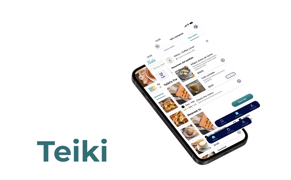
Client: Teiki
Tools: Figma, Illustrator, Miro
As a UX designer, I redesigned Teiki to address the significant UX/UI issues that created navigation issues for local users in Argentina, so retention in users could go up in the field can propel biological and technology purposes.

Painting the Picture
Initially called in by the leadership team at Teiki to improve the user experience within the mobile app and the retention rate in user testing, significant issues with the UX/UI that created navigation problems.
The goal of Teiki’s redesign was to enhance the user interface by incorporating improvements to the home landing page, status order flow, search functionality, and more.
Problem Statement
Users that are interested in a user friendly delivery mobile app that helps prevent them waiting in line at their favorite restaurants or stores because current apps in Argentina aren’t accessible to those that struggle with technology.

Understanding Users
The target market is diverse ranging between Argentina locals aged 21-65+ looking for a service to order drinks or food via delivery because they don't have the time of day. Examples include stay at home parents, students, workers, and locals that are hungry or thirsty.
To demonstrate the target market through a specific lens, I decided to create two user personas to understand their needs and wants.

While both personas are different in age and responsibilities, they don't have the necessary time allocation to freely purchase food or drinks in person.
Enter, Teiki, to solve their time issues.

User Flow
“As a busy young worker, Joe struggles to find time to order his favorite cup of coffee. Joe wants to use Teiki to order his coffee so it’s ready to pick up as he walks into Sao-Medialunas.”

Why this particular task flow?
Ordering an drink or pile of food will be the most common task by users on Teiki. I felt it was important to showcase how the process flow will conduct itself to avoid error.
Redlining Analysis
To improve user experience and functionality on the current iteration of Teiki, we listed the following pain points of the prototype.


Given the lack of agreement among stakeholders regarding visual identity, we prioritized the flow update and conducted user testing to validate our initial assumptions.
User Testing

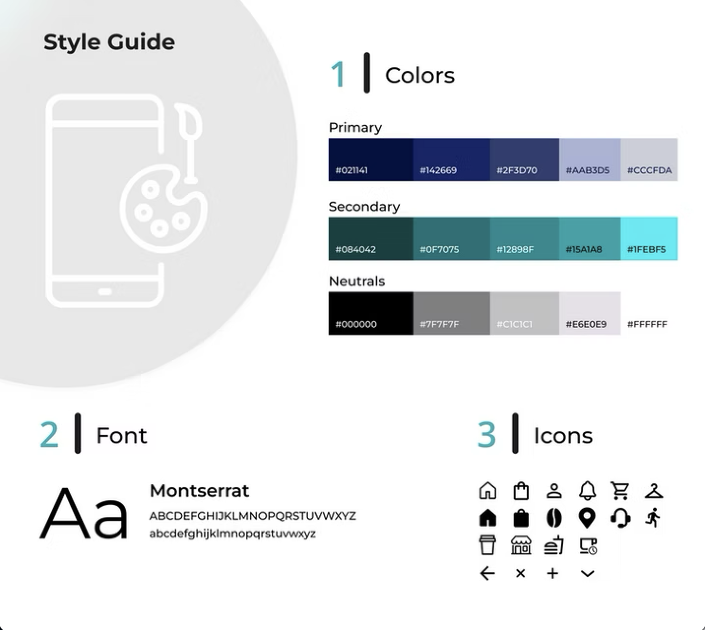
KPI’s and Style Guide
3,000
number of users that have joined Teiki app since launch
87%
Users prefer redesign over previous design in usability testing
$15000
Funds raised at Teiki to start app development
The Outcome

Sign Up and Home Screen
Ordering Placing Flow

Order Tracking

Reordering Flow

Key Takeaways
Have designers design!
The team at Teiki initially had the head of marketing work in Figma to create the mobile product design. It was a mess to sum it up quickly! The engineers shortly after worked on it and while it looked improved, it was missing UX principles. Whether you're a startup or massive company, it's never wise to cut costs in your design department. You have to let designers design!
Small team size = stay ready for problems
Working with a small team of 10 people can make things difficult if each person isn't fully on board. It can lead to miscommunication, late deliverables or departments pointing fingers at one another. Startup energy is a real thing so keep on all ten toes to stay ready for problems.
Working with an international market
The process of understanding an international market like Argentina is not a problem I faced previously. To understand and navigate the constraints of not knowing the local scene, I relied on my co-workers who lived in Buneos Aires to understand the people and culture of their city.
You won't always get what you want
During the development process on including a more structured order status process, I brought it up to the CEO (who happens to be the lead engineer). After explaining why it would make sense to do so, he rebuffed me immediately and said customers will pay via third party using WhatsApp. Due to the rumblings of fraud and privacy concern on WhatsApp, I couldn't believe what I was hearing. Lesson be learned as a designer: You won't always get what you want.